20+ years building brand identity
at Google, Uber, and beyond.


Cruise was unlike most things I had worked on. In an Uber, the driver is there to answer questions. On a Cruise, the experience had to be intentional enough to anticipate every rider need. Down to an icon of a car with an arrow pointing to the correct exit door. Few precedents. Little to compare against.
I joined as Staff Brand Designer right before its transition from R&D to public rollout. The identity had been established before I arrived. My role was to scale it across a wide surface: consumer-facing product, internal tools, marketing, and a shared design system. All while infusing approachability into a highly advanced technology. Expressive lines with width variations in the feature icons and illustrations, and motion as a core part of the visual language.
Working closely with product designers, UX writers, and PMs, I led the expansion of the visual identity system, defining the icon style and overseeing the creation of hundreds of UI and feature icons. I extended the color system across disciplines, built and managed a design org brand portal, and ran office hours and critiques to sharpen the design work coming out of the org.
2021–2024


Back in 2014, when I joined Uber, the company had outgrown its identity. What began as a premium ride service had become, during a period of hyper-growth, a global platform spanning dozens of products and price points. The existing brand had no language for that complexity.
Working closely with the head of design and Uber's leadership, the answer was a core concept called Bits & Atoms: technology meeting the physical world. That tension became the foundation for the entire design framework, structured in two parts: consistent monochromatic components rooted in the Bit, creating coherence across every expression; and colorful, variable components rooted in the Atom, enabling localization and keeping the system fresh across markets.
Drove the project end to end. Defined the design framework, crafted the Uber wordmark and its sub-brands, created the color spectrum and established the color architecture. Built and maintained the brand guidelines portal, defining guidelines, templates, and branded examples across print, packaging, web, and product.
Team: Head of Design: Shalin Amin · Design Manager: Strahan McMullen · Lead Brand Designer: Roger Oddone · Designers: Bryant Jow, Catherine Ray, Donald Wong, James Bamford, Lian Ng, Matt Riley, Mirtho Prepont.
2016


After the flat design language was established across desktop apps, the gap between desktop and Android became impossible to ignore. Google's design organization was tasked with unifying the two, and a cross-functional team was assembled, drawing designers from across the company, to work on the project. It launched internally as Quantum Paper, and publicly as Material Design.
My contribution was twofold: evolving the flat icon style to carry more tactile, paper-like depth while staying true to its geometric foundation, and building Google's color system from scratch. For color, I started with Google's four brand colors and expanded outward, building a full spectrum that designers across the company could share. To make the system usable at scale, I introduced a numerical naming convention, 50 through 900, assigning a value to each tone in the spectrum. That structure became standard practice across the industry after Material Design launched.
Before Material Design, as part of Project Kennedy, I built Google's first company-wide visual asset guidelines: a comprehensive framework covering product icons, logo lockups, UI icons, and illustration principles. The goal was a document rigorous enough that a vendor in a different timezone could produce work indistinguishable from work made in-house. The guidelines shipped internally in 2012 and were published on Behance in 2013, where they reached over 1 million views and were featured as Best of Behance. See them here: Part 1 and Part 2.
2011–2014
After the flat design language was established across desktop apps, the gap between desktop and Android became impossible to ignore. Google's design organization was tasked with unifying the two, and a cross-functional team was assembled to work on the project. It launched internally as Quantum Paper, and publicly as Material Design.
My contribution was twofold: evolving the flat icon style to carry more tactile, paper-like depth while staying true to its geometric foundation, and building Google's color system from scratch. I introduced a numerical naming convention, 50 through 900, that became standard practice across the industry after Material Design launched.
Before Material Design, as part of Project Kennedy, I built Google's first company-wide visual asset guidelines covering product icons, logo lockups, UI icons, and illustration principles. They shipped internally in 2012 and reached over 1 million views on Behance, featured as Best of Behance.
2011–2014
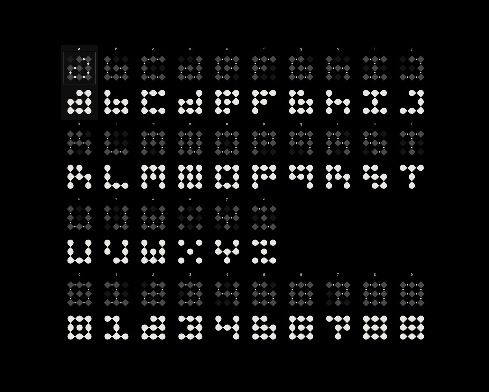
HG26 is an experimental typeface where the letterforms are vessels, the particles are the texture that fills them, and interaction is what sets them in motion. The grains behave like sand in an hourglass, some drawn toward the cursor and pushed away by it, others left to fall under gravity.
It began as an exploration of particles, and the typeface emerged as the vessel that gave them purpose. As much as anything, it is built to be played with.
2026


Aero is a semi-private airline offering a premium, intimate flying experience between select destinations.
Aero came to me in 2019 to design the livery for their first plane and revisit the logo. The goal was to elevate the perception of luxury. My advice was to keep the symbol and wordmark but refine the palette, removing the blue tones and developing a warmer spectrum of yellows, oranges, and reds that better expressed the sunrise idea at the core of the brand.
Rather than forcing the window color stripes onto other parts of the plane, we deconstructed the color component of the symbol and morphed it to fit the fuselage. The symbol was placed in the first window, and the staircase was wrapped in the gradient palette, turning boarding into part of the experience.
Testing the livery on black revealed something unexpected: the warm tones against dark backgrounds made the palette richer and more distinctive among airlines. That discovery became the foundation for a broader identity system built around Haas Grotesk and a restrained Swiss-inspired grid, flexing across boarding passes, destination cards, and amenity packaging while keeping the identity unmistakably Aero.
2019


After Uber, I started Oddone, a brand identity studio in San Francisco specializing in visual identities for forward-thinking businesses.
The studio's own identity was the first project, and being our own client is always hard. Partnering with brand strategist Caren Williams was essential in this process of self-discovery, forcing clarity about my values. The core idea that emerged: I explore every angle of an idea. The "O" is treated as a three-dimensional object that reveals a different form depending on the perspective, so that each view shows a different dimension of the same thinking. Strategy, design, and exploration, finally made visible.
After launching, I decided to push the system further, creating a series of expressive posters rooted in the same visual logic, developing a motion language for the brand in the process.
Creative Director / Designer: Roger Oddone · Brand Strategist: Caren Williams.
2018

Expa is a company studio that partners with founders to build companies from zero.
This project evolved the website: expanding the case studies, sharpening how the studio articulates its approach with the highest level of design and technology craft.
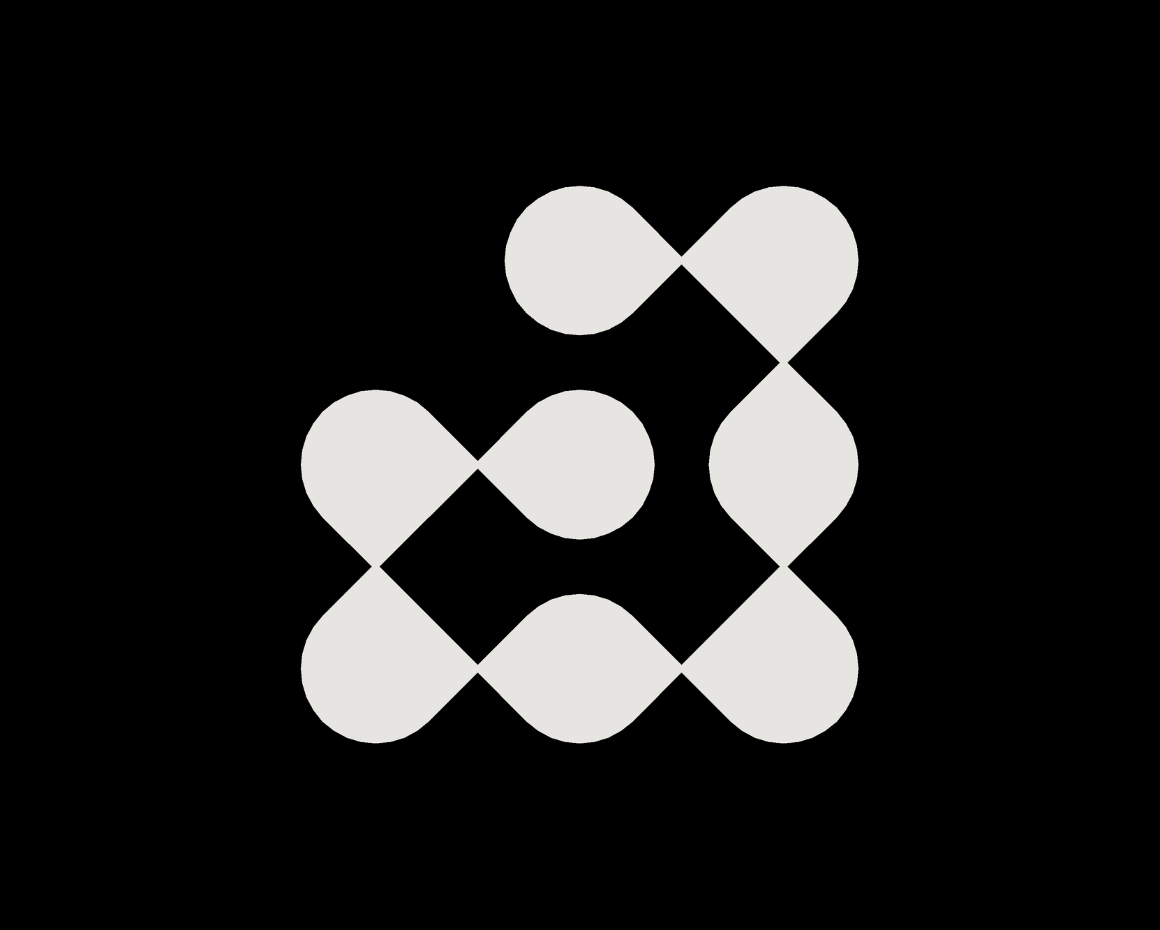
At the heart of the identity are the dots that form the letters of Expa, representing the companies the studio works with. Each one distinct, together forming something larger. The logo animation expresses that idea through movement: a 3D grid of 2D-looking spheres rotates like the face of a cube to reveal each letter in sequence. Four letters, four faces, one continuous motion.
2025
Expa is a company studio that partners with founders to build companies from zero.
This project evolved the website: expanding the case studies, sharpening how the studio articulates its approach with the highest level of design and technology craft.
At the heart of the identity are the dots that form the letters of Expa, representing the companies the studio works with. Each one distinct, together forming something larger. The logo animation expresses that idea through movement: a 3D grid of 2D-looking spheres rotates like the face of a cube to reveal each letter in sequence. Four letters, four faces, one continuous motion.
2025


Sushi No Ma is an ultra-private, 8-seat omakase sanctuary tucked within an exclusive club in LA, with views of the Hollywood Hills. An experience as carefully composed as the food itself.
The symbol is drawn from the restaurant's view of the Hollywood Hills, rendered with deliberate imperfections to evoke a Japanese Hanko stamp. The typeface was chosen for its resemblance to Japanese characters and set vertically, reinforcing the cultural authenticity of the experience. Precise without being cold, intimate without being casual.
2024